Geographic Restriction & Risk Notice
Not available to U.S. persons/residents. Trading involves substantial risk and may result in loss of capital. This report is for informational purposes only and is not investment advice or a solicitation in any jurisdiction.

Why we publish monthly reports (and why “risk-first” matters)
Most trading performance content online is built to impress, not to inform. That usually means highlighting the best months, minimizing uncomfortable statistics, and using language that implies repeatability (“consistent,” “steady,” “safe,” etc.). That isn’t how serious risk management works.
Our goal with FGP5 monthly reporting is different: transparency, context, and discipline.
A single month’s return—good or bad—doesn’t tell you much on its own. It becomes useful only when you pair it with the rest of the picture:
- What level of drawdown was observed in the same reporting window?
- How many trades produced the result (and were they concentrated in one symbol or distributed)?
- What do the statistics suggest about variability and trade behavior?
- What’s the market environment, and how does it relate to the assets traded?
This January report is written with that framework in mind.
January 2026 headline result
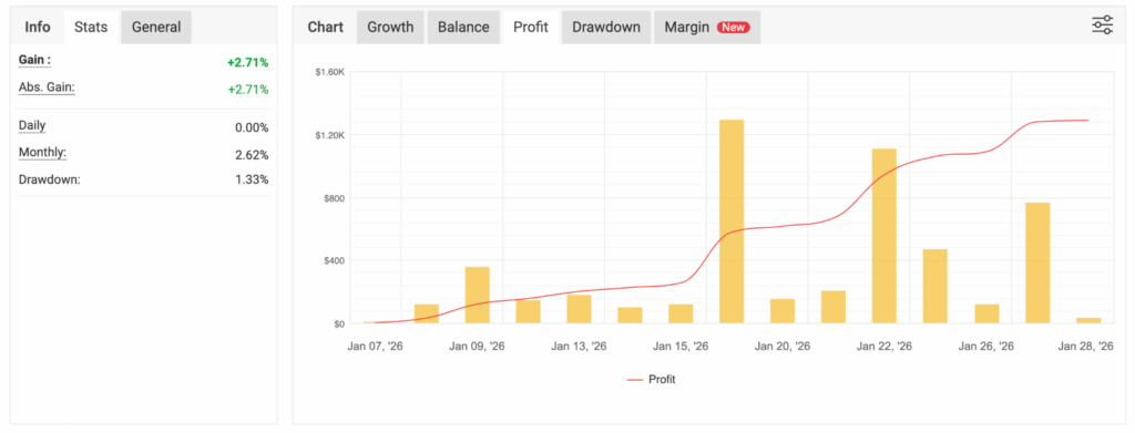
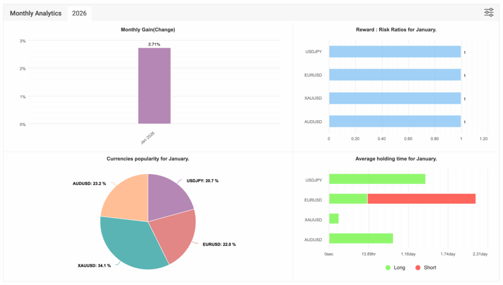
For January 2026, the Myfxbook views provided show a monthly performance in the ~+2.7% range:
- The Myfxbook summary panel shows Gain / Abs. Gain: +2.71%
- The same panel shows Monthly: 2.62%
- The Monthly Analytics view shows Jan 2026: 2.71%
Those values are close enough that the most accurate and honest headline is ~+2.7%, and in this report, we treat it as a single-month snapshot—not a forward projection.
Drawdown figure displayed: 1.33% (as shown on the same Myfxbook panel view).
It’s important to state this plainly: drawdown is not a footnote—it’s part of the cost of the return profile. This is why we publish both.
January at a glance: key stats from the screenshots
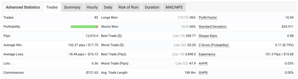
The Advanced Statistics summary view provided for January includes the following:
- Trades: 82
- Pips: 12,410.4
- Profit Factor: 16.94
- Sharpe Ratio: 0.58
- Expectancy: 151.3 pips / $15.68
- Best Trade: $208.77 (Jan 19)
- Worst Trade: -$35.25 (Jan 22)
- Average Trade Length: 18h 8m
- Commissions: -$121.63
- Longs Won: 96% (73/76)
- Shorts Won: 66% (4/6)
A few notes about how to read these:
- Profit Factor can be attention-grabbing, but it’s still a month-specific statistic. It should never be interpreted as a guarantee of persistence.
- Sharpe Ratio is a risk-adjusted metric; even so, it’s sensitive to time window and sample characteristics.
- Expectancy is one of the more useful “process metrics,” but it can change as volatility and market regimes change.
- The month’s best/worst trade numbers help illustrate the spread of outcomes, but they do not predict future dispersion.
What we traded in January (and what dominated activity)
January trading activity was distributed across a four-instrument mix. Your Monthly Analytics “Currencies popularity” chart shows the activity distribution for the month as:
- XAUUSD: 34.1%
- AUDUSD: 23.2%
- EURUSD: 22.0%
- USDJPY: 20.7%
From a risk perspective, this matters for two reasons:
- Concentration risk
When a strategy is overly concentrated in one symbol, the month’s outcome can be largely dictated by that symbol’s microstructure, volatility regime, and correlation behavior.
In January, the activity is more evenly split than a single-symbol month, with XAUUSD leading but not dominating to an extreme. - Correlation and regime
Even when you trade multiple instruments, correlations can tighten during specific regimes (risk-on/risk-off waves, central bank surprises, or broad USD-driven moves). When correlations tighten, “diversification” can shrink in real time.
That’s why we don’t just list symbols—we watch how they behave together.
Symbol-level contribution (profit in account currency)
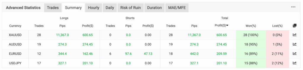
From the per-symbol table you provided (showing total profit by instrument), January’s profit contributions were:
- XAUUSD: $600.65
- AUDUSD: $274.45
- EURUSD: $209.59
- USDJPY: $201.10
Two practical takeaways:
- XAUUSD was the top profit contributor in the month’s table view, aligning with its role as the top activity share.
- The rest of the basket contributed in a supporting, more balanced way—useful when the goal is to reduce reliance on a single instrument.
Also worth noting: the same table view shows very strong win rates across instruments in January (including 100% on XAUUSD in the view shown). That can happen in a month. The responsible interpretation is: that’s a month-specific outcome—not something to extrapolate.
Longs vs shorts: what the month suggests about directional behavior
Your Advanced Statistics summary includes directional win rates:
- Longs won: 96% (73/76)
- Shorts won: 66% (4/6)
This is meaningful because it suggests January’s outcome was driven primarily by the strategy’s long-side behavior, with a much smaller sample of shorts contributing to the overall month.
However, directional win rate should always be interpreted carefully:
- A high long win rate in one month can occur because of the regime (trend alignment, mean-reversion conditions, volatility compression, etc.).
- The distribution of trade durations and the “shape” of winners/losers matters as much as the percentage itself.
- High win rate does not automatically mean low risk. If losses are rare but large, the risk profile can still be aggressive.
In this January set, the worst trade shown is -$35.25, which suggests that in the reported window, losses did not dominate the month’s P&L. But again: that does not guarantee the same shape in future months.
Time-in-market: average trade length and duration distribution
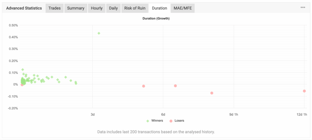
The Advanced Statistics summary shows an average trade length of ~18 hours. The Duration (Growth) visualization also shows a dense cluster of winners in shorter holding windows, with a small number of losing outcomes occurring at longer durations.
Why this matters:
- Duration is exposure. Time held is time exposed to volatility, gaps, and correlated moves.
- Strategies with very long holding times can be more vulnerable to macro shocks.
- Strategies with very short holding times can be more sensitive to spreads, execution quality, and micro-volatility.
The Monthly Analytics “Average holding time” view reinforces this “mixed-duration” behavior across instruments in January:
- XAUUSD shows the shortest average holding time (relative to the others in the view).
- EURUSD shows noticeably longer exposure on the short side (in the chart provided).
- AUDUSD and USDJPY appear in the middle—more “moderate hold” relative to XAUUSD.
Taken together, January’s data points to a profile that is not purely scalping and not strictly long-term swing—m
ore of a short-to-moderate holding approach, based on the month’s reporting.
Hourly and daily behavior: what we can—and can’t—conclude
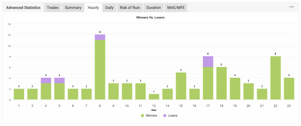
You included Hourly and Daily charts showing winners vs losers. These visuals can help spot whether performance is heavily concentrated in a specific hour band or weekday pattern.
The correct way to use these charts is diagnostic, not predictive:
- If a strategy only performs during one narrow hour band, that can be a fragility risk.
- If losses cluster around certain session transitions (rollover, liquidity shifts), it may indicate a vulnerability.
- If outcomes are broadly distributed, it can indicate a more robust exposure set—though it still depends on the underlying logic.
In January’s Hourly chart, outcomes appear distributed across many hours, with visible clusters around several time blocks (including a notably higher activity bar around one of the morning-hour buckets, and additional clusters later in the day). Losers appear in a small number of hour buckets, consistent with the month’s low loss count relative to total trades.
In January’s Daily chart, outcomes show meaningful activity across the week, with Thursday appearing as the largest concentration of total trades in the view provided, and losses remaining limited relative to winners.
Because these charts are month-specific, we treat them as “what happened,” not “what will happen.”
Risk of Ruin: helpful model output, not a promise
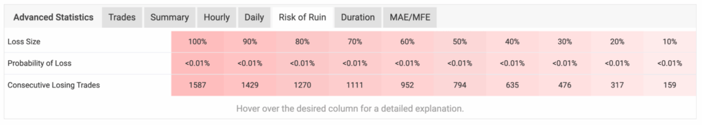
Your Risk of Ruin panel shows a Probability of Loss <0.01% across multiple loss-size thresholds in that view, along with very large “consecutive losing trades” numbers at those thresholds.
A responsible interpretation:
- Risk of ruin calculations are model-driven outputs based on historical trade behavior and assumptions about independence and distribution.
- They can be useful as a reference to compare configurations or regimes.
- They are not a guarantee against losses, drawdowns, or adverse conditions.
Markets can change faster than models. “Low probability” is not “impossible,” and this is why we always anchor the conversation to drawdown tolerance and disciplined reporting.
Equity and growth chart: why we track both
Your Myfxbook chart shows the month’s progression through a series of profit bars and a rising profit curve, with several notable “step-up” moments during the month.
Even without narrating every swing, the reason this matters is simple:
- Balance typically reflects closed trades.
- Equity reflects open trade fluctuations.
If equity consistently diverges from balance, it can signal that open trade volatility is a major part of the experience. If equity and balance track closely, it can suggest tighter exposure control—though that depends heavily on strategy design.
For January, we use this chart as a visual confirmation of progression and volatility footprint, not as a marketing “proof.”
Comparing trading results to traditional investments (the compliant way)
People often ask: “How does ~+2.7% in a month compare to savings, CDs, bonds, or index funds?”
The compliant and responsible answer is: they are different instruments with different risk profiles, and the comparison should focus on volatility and drawdown tolerance—not just the return number.
Savings accounts / CDs
- Designed for capital preservation and liquidity (depending on terms).
- Typically lower volatility than trading strategies.
- Returns are often bounded by prevailing interest rate conditions and terms.
Bonds
- Can be lower volatility than equities in many environments, but not always.
- Subject to duration risk, credit risk, inflation expectations, and policy surprises.
- Can experience meaningful drawdowns in rising rate regimes.
Equity index funds
- Historically growth-oriented, but can experience deep drawdowns during recessions, crisis periods, or valuation resets.
- Returns are uncertain over short windows and heavily path-dependent.
Active FX trading strategies
- Can express returns under varied conditions, but carry meaningful risks including drawdowns, regime shifts, and periods of underperformance.
- Can be sensitive to market microstructure, volatility, and correlation behavior.
Bottom line: FGP5 is not a replacement for traditional tools. It is a different exposure profile. Anyone evaluating a trading strategy should do so with a sober understanding that losses are possible and outcomes vary.
What we want readers to take away from January
If you only remember three things from this report, make it these:
- January was approximately ~+2.7% based on the Myfxbook views provided, but it is one month—not a forecast.
- Risk context is part of the story. The drawdown figure displayed (1.33%) matters, and we publish it for transparency.
- The month’s activity was distributed across four instruments, with XAUUSD leading activity share and profit contribution in the month’s table view—while AUDUSD, EURUSD, and USDJPY provided meaningful supporting contribution.
This is the kind of reporting cadence we prefer: consistent, measured, and grounded in what the data shows—not in what marketing wants to imply.
Compliance & Geographic Restriction
This content is for informational purposes only and does not constitute investment advice, an offer, or a solicitation. Trading involves substantial risk and may result in loss of capital. Past performance is not indicative of future results, and no guarantees are made. Participation is geographically restricted and not available to U.S. persons/residents, and may be restricted in other jurisdictions where such activity is prohibited.

FGP1 June 2026 Performance Overview
Geographic Restriction & Risk Notice FGP1 is geographically restricted and is not available to U.S. persons or residents. Trading involves substantial…

Best Day Trading App: What Traders Should Look for Before
Day trading has become more accessible than ever. With the rise of mobile technology, cloud-based platforms, and real-time market data,…

Top Stock Brokers: How to Choose the Right Platform for
Choosing from the top stock brokers can feel overwhelming. There are many platforms, account types, tools, fees, apps, and trading…

Currency Strength Meter: How Traders Use Currency Strength to Read
What Is a Currency Strength Meter? A currency strength meter is a trading tool that helps traders compare the relative strength…

Commodity Prices Today: How Traders Can Read Market Movement With
Introduction Commodity prices today can move quickly. Oil, gold, silver, copper, wheat, corn, natural gas, and other raw materials can all…

Autopilot App: A Simple Guide to Smarter Trading Automation
IntroductionWhat Is an Autopilot App?Why Traders Are Interested in Autopilot AppsHow an Autopilot App WorksAutopilot App vs Manual TradingMain Benefits…
